A Bold New Look: The Story Behind nuwacom’s New Corporate Design


Why We Rebranded – A Vision for the Future
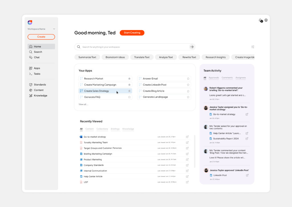
A strong brand evolves alongside the product it represents. As nuwacom continues to develop, our new identity ensures that design and functionality move forward together, creating a more cohesive and intuitive experience.
This transformation is more than a visual refresh — it marks the beginning of an ongoing process to refine both our platform and the way we present it. While our solutions already drive efficiency, automation, and collaboration, we are continuously working to enhance usability, streamline workflows, and create an even more seamless experience.
With this evolution, we aim to:
- Strengthen our positioning as the go-to AI workspace for marketing and communication teams.
- Align our brand identity with our product experience to create a consistent, user-focused journey.
- Drive continuous improvements that make work easier, more efficient, and more impactful.
This rebrand sets the foundation for what’s next—an ever-improving platform experience designed to keep pace with the evolving needs of modern teams.

The Design Story – More Than Just a Logo
The Figurative Mark and Its Meaning
Our figurative mark combines multiple meanings.
- Workflows & Automation → The structure symbolizes efficiency and seamless processes, just like how nuwacom optimizes workflows.
- Collaboration → The design emphasizes teamwork and interaction, reinforcing our belief in human + AI collaboration.
- Efficiency & Growth → The upward-right arrow signals progress, acceleration, and success, mirroring how our platform helps businesses scale.
- Customer Control → The shape also resembles a steering wheel, symbolizing that our users always remain in control.
Typography: Dynamic and Tech-Oriented
A Bold Color Palette That Stands Out

What’s Next – The Future of Our Platform
